project 03
Apple TV+
Redesign Apple TV+ to improve content discoverability and usability
PrOJECT TYPE
Academic
role
UI/UX Designer
YEAR
2024
BACKGROUND


Apple TV+ launched in 2019 as Apple's entry into the streaming market, bundled with Apple devices and positioned around exclusive original content. Unlike competitors such as Netflix or Hulu, it has a smaller content library — making discoverability and ease of navigation even more critical to user retention.
While Apple users benefit from seamless ecosystem integration, non-Apple users face additional friction navigating a platform that wasn't designed with them in mind. This project examines how restructuring the Apple TV+ interface could make the experience more intuitive and accessible for a broader audience.
Research & Insight
RESEARCH METHOD
I began with a research question:
How might we redesign the Apple TV+ experience to help new users more easily discover, organize, and access content across mobile and desktop platforms?
10
INTERVIEWS
with active Apple TV+ users
100+
ONLINE REVIEWS
from the general Apple TV+ user base on Reddit, Apple Support Community, and Apple Store
Decision Tree
The tree's structure reveals Apple TV+ as subscription-first: three entry points collapse into one flow, with the paywall as the only meaningful branch.
NAVIGATION DECISION TREE
Search
NO
Simplified to illustrate the core decision architecture — not a 1:1 map of the interface.
Open Apple TV+
Watch Now
Library
Select Title
Included in Apple TV+?
Stream Now
YES
NO
Save to Watchlist?
Saved ✓
Browse More
YES
Confirm Purchase?
Play Now
Cancel
YES
NO
Rent / Buy
User Interview
10 user interviews revealed three recurring pain points that consistently disrupt the Apple TV+ viewing experience.
USER RESEARCH FINDINGS
01
Navigation Issues
Confusing categories make it hard to find a show.
USER A
"Genre headings require you to keep clicking on the right arrow to find a show... It's tedious to find a show."
USER B
"I don't know where the search bar is. Does 'Watch Now' include both subscription-based and rental content?"
02
Missing Key Functions
Key features such as a watchlist, a search bar, or a "skip the intro" option are missing.
USER C
"Search and Watchlist are fundamental to any streaming platform, but they're nowhere to be found."
03
Lack of Feature Optimization
The Library section, which is unique to Apple TV+, isn't fully utilized.
USER D
"Unlike purely subscription-based platforms, Apple TV+ offers rental or purchasing options that incentivize users to utilize the content library."
MOVING FORWARD...
01
Rearrange, create, and remove categories to facilitate content discovery.
02
Research key functions of streaming platforms and implement them for cross-platform design consistency.
03
Develop and highlight the Library for product differentiation.
ITERATIONS
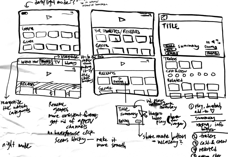
Wireframes
This step helped to paint a bigger picture of the user experience and consider the practicality of some features I wanted to incorporate.
I also looked at examples from other streaming websites to learn more about UI principles for video-centered products. I noticed that some common features were “Continue Watching,” “Recents,” and a user’s “Watchlist.”
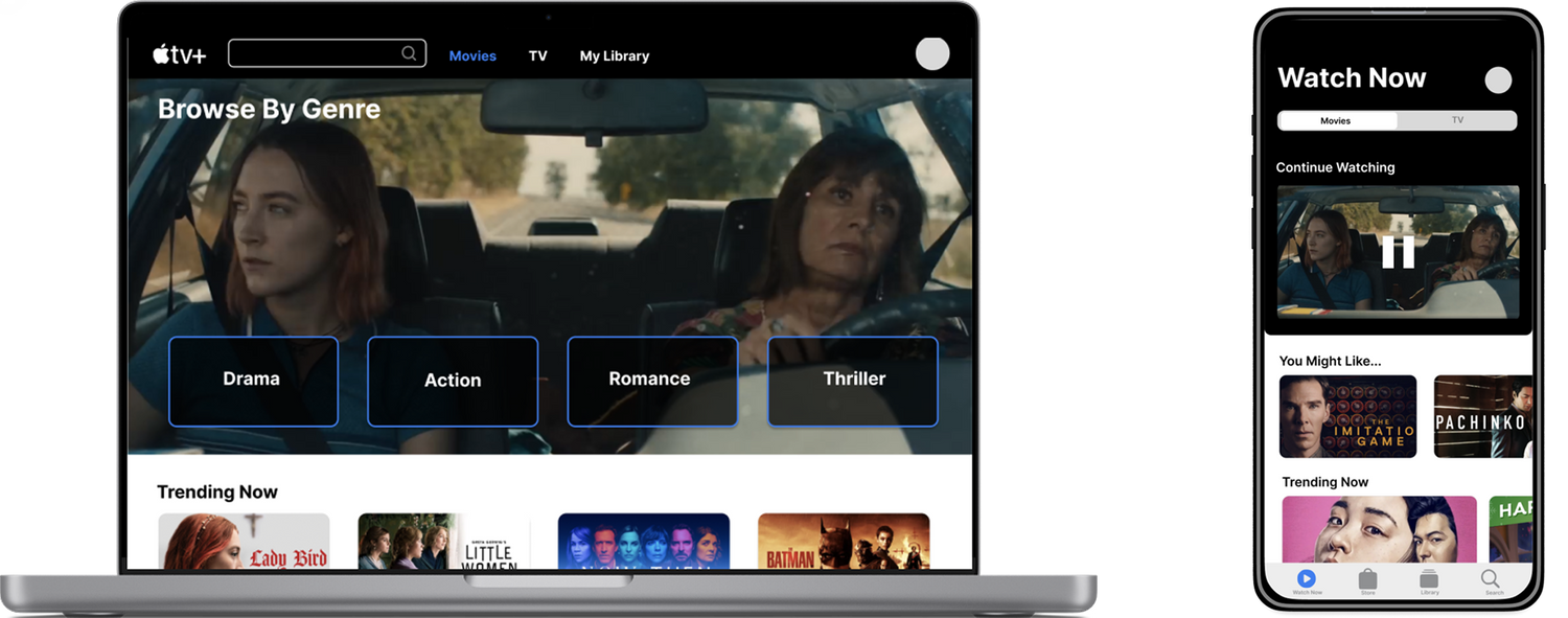
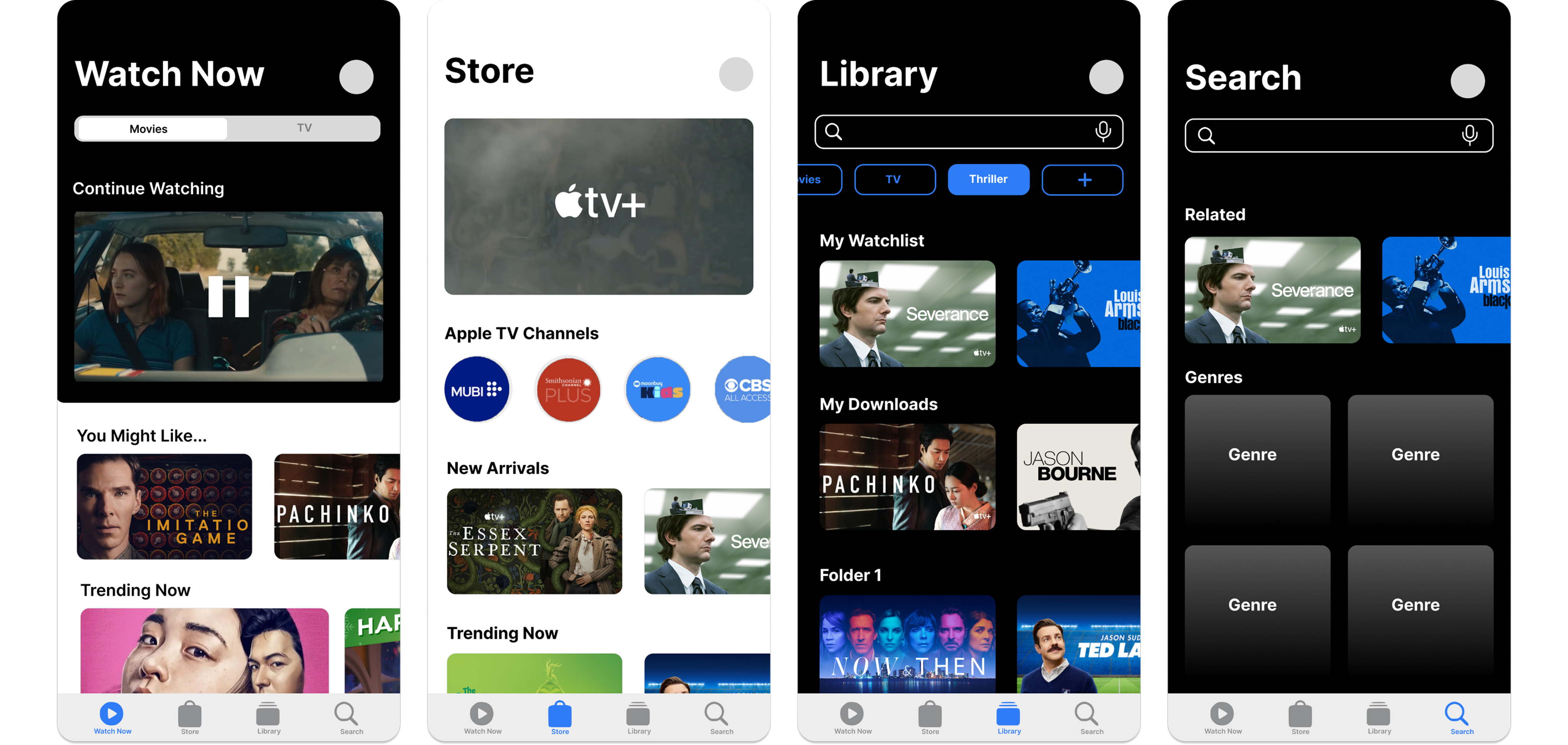
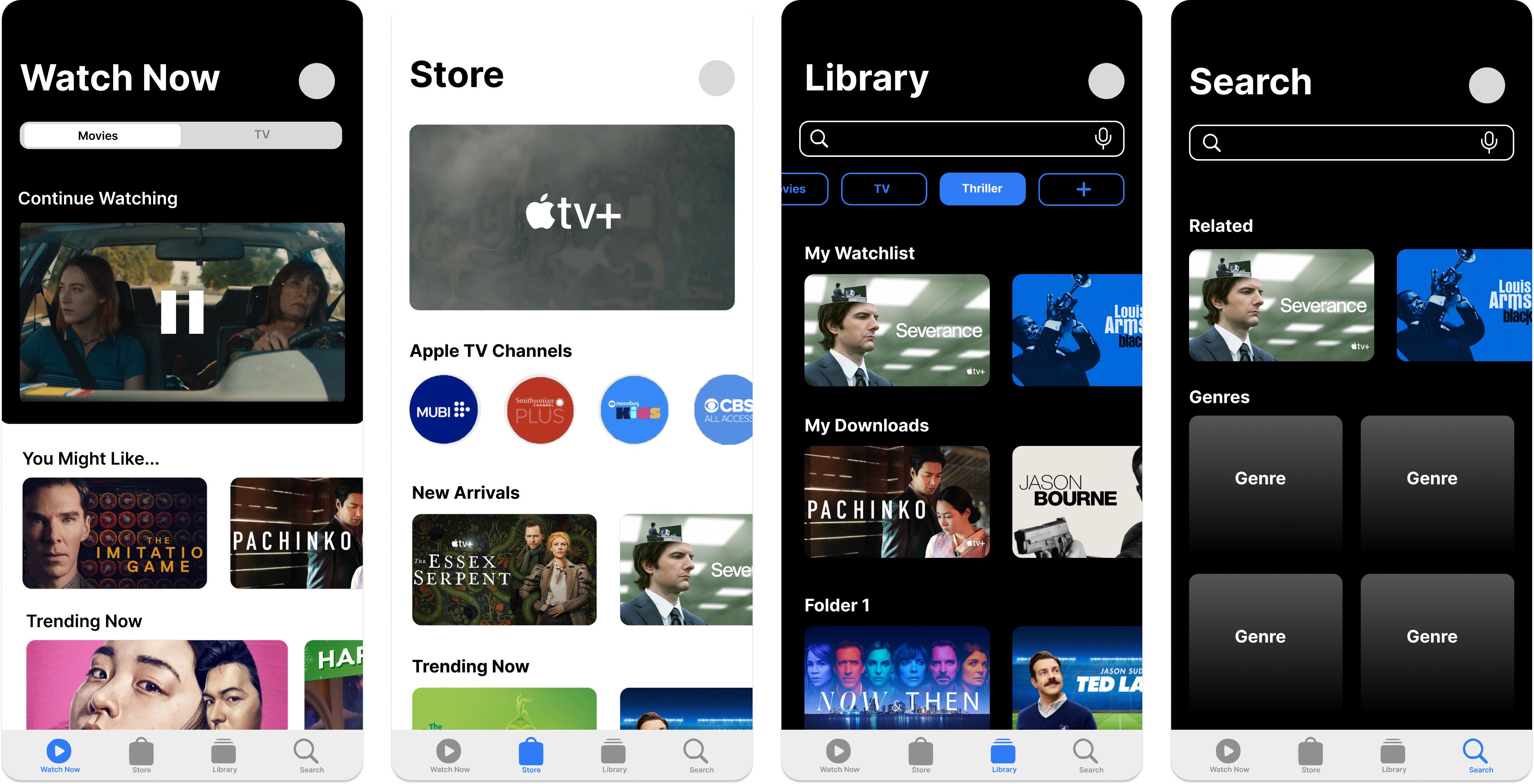
MOBILE PROTOTYPE MODIFICATIONS
Key Redesigns (Mobile)
1
Apple TV+ Originals placed under the "Store" category
2
A toggle feature that separates Movies from TV
3
A "Continue Watching" option
4
A Library tab on the home page
Watch Now

Movies
TV
Continue Watching

You Might Like...
Trending Now
Top Picks

2
3
4
Store
Apple TV Channels

New Arrivals
Staff Picks
New on Apple TV+
Browse by Genre
1
Library
My Playlist
My Downloads
Recently Added
Watch History
Search
Q
Related Movies
Genre
Top Searches
Recently Searched
Browse Categories

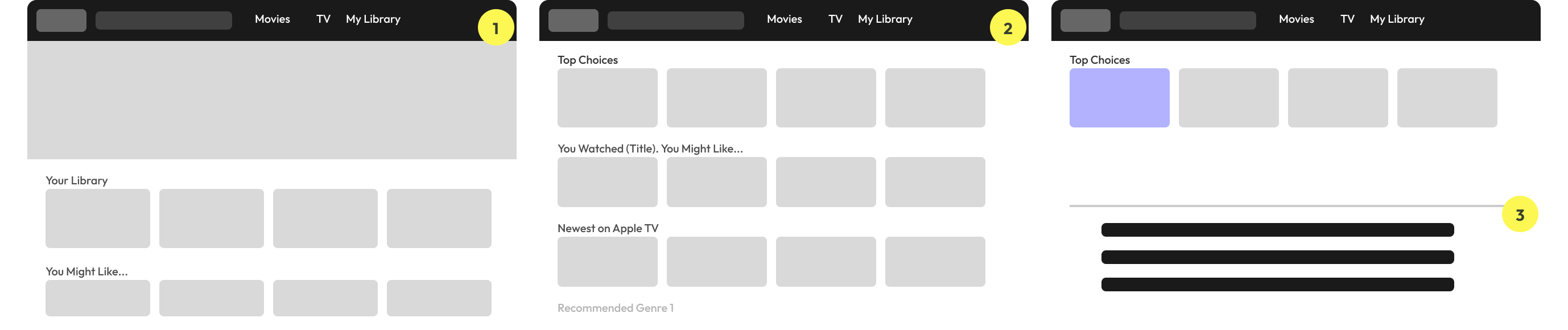
DESKTOP PROTOTYPE MODIFICATIONS
Key Redesigns (Desktop)
1
The elimination of "Watch Now" and "Kids" sections
2
The integration of the "Watchlist" in "Library"
3
The addition of a step between the landing page and the movie description page through a pop-up box
TAKEAWAYS FROM USER TESTING
01
Content Navigation
TASK
Find the cast of a movie from My Watchlist
↓
FINDING
Users could not intuitively navigate from the Watchlist to a movie's cast information.
↓
NEXT STEPS
Make the Watchlist more visible on the home page
02
Library Feature Integration
TASK
Make a folder in your library
↓
FINDING
Users were unable to discover the folder creation feature without prompting. Many expected a more prominent entry point, and participants raised concerns about folder clutter on the mobile screen.
↓
NEXT STEPS
Add a pop-up to nudge the user to use the library system, add the ability to search for a specific category, and consider space with many folders in mobile
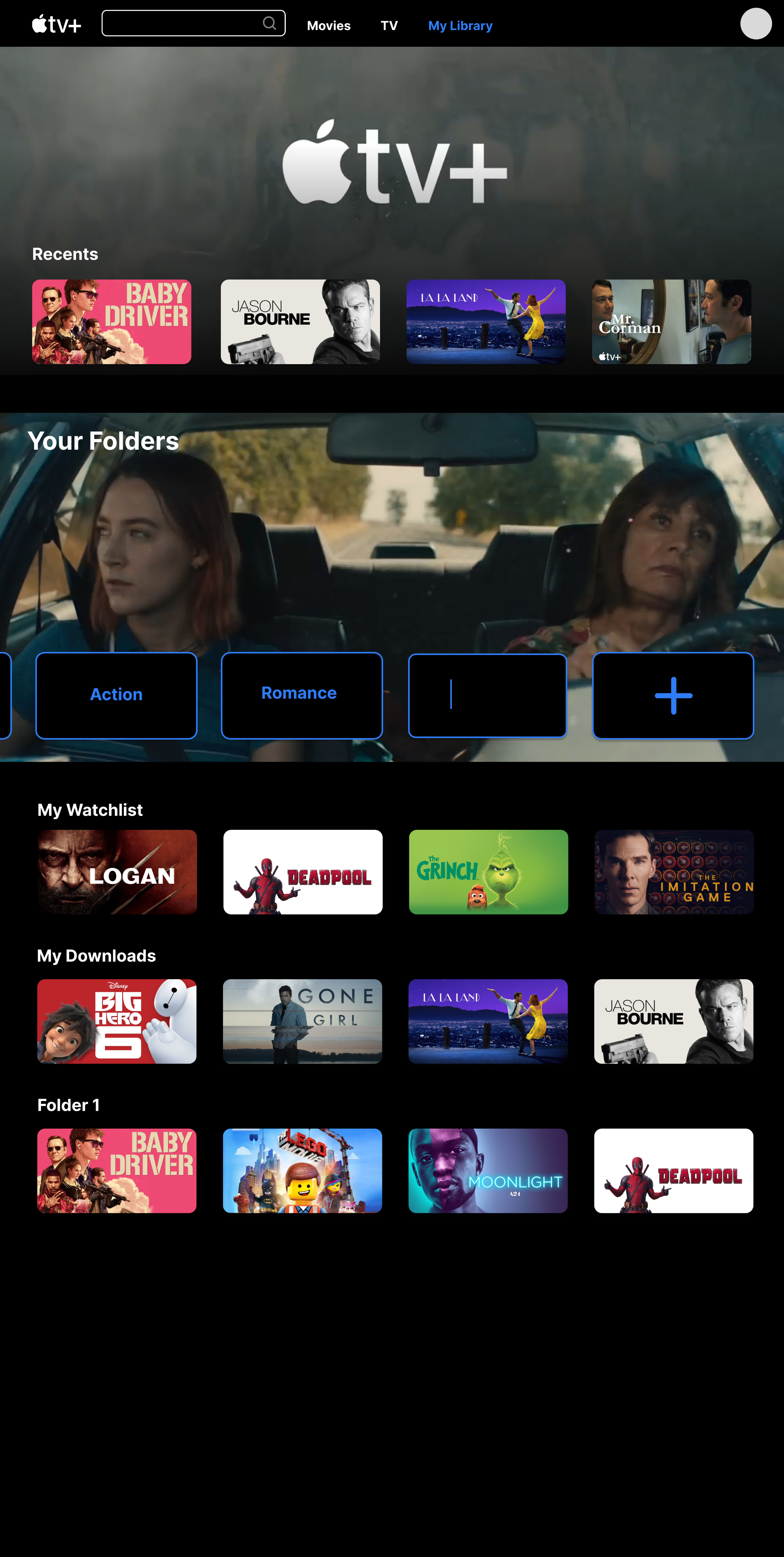
final prototype
High-Fidelity Prototype
The final prototype showcased streamlined layouts, easy-to-navigate sections, and appropriately sized thumbnails, which contributed to an improved visual experience for users.
For the purpose of the case study, I focused on three main features; homepage, content detail page, and the Library.
HOMEPAGE
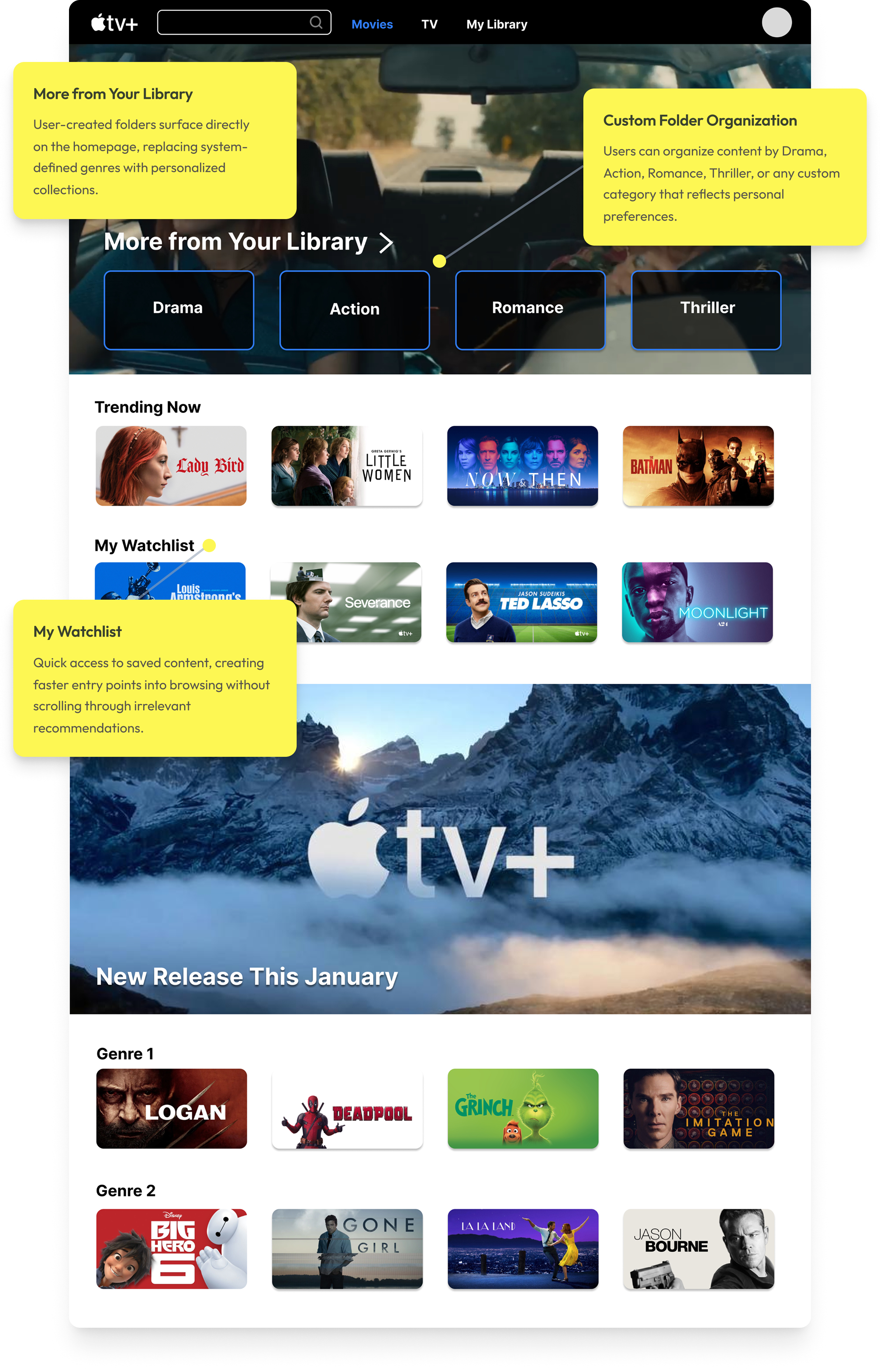
The redesigned homepage prioritizes "More from Your Library", allowing users to immediately browse content based on previously saved or watched titles. Instead of relying on system-defined genres, this redesign surfaces user-created folders from the Library (e.g., Drama, Action, Romance, Thriller) directly on the home page.
This empowers users to organize content in a way that reflects their personal preferences and creates faster, more meaningful entry points into browsing.
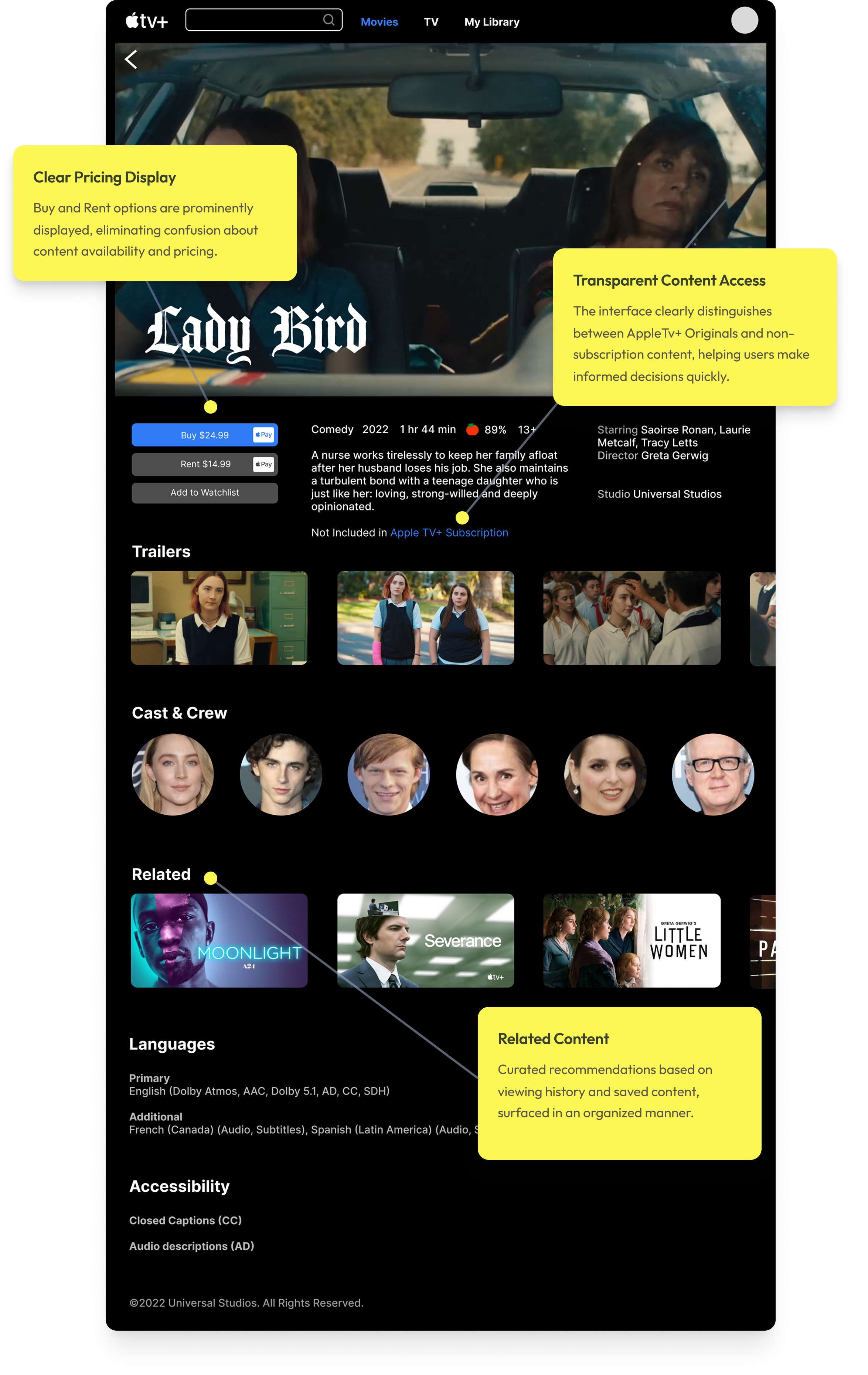
CONTENT DETAIL & PRICING
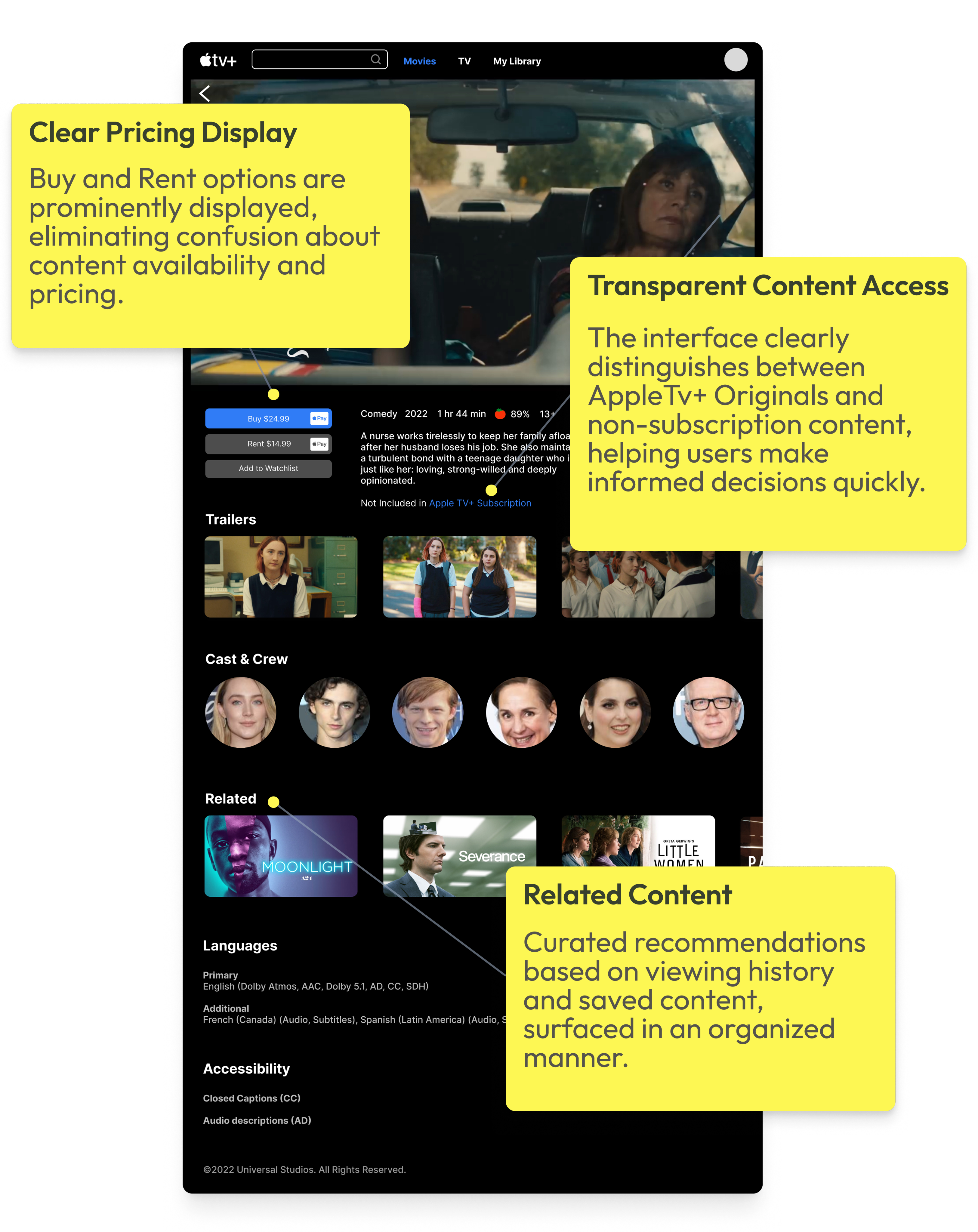
The original Apple TV+ interface often blurs the line between included content and rentals, creating confusion about what users can watch immediately. This redesign clearly surfaces pricing and purchase options (“Buy” vs. “Rent”) alongside the primary call-to-action, reducing uncertainty and helping users make faster decisions.
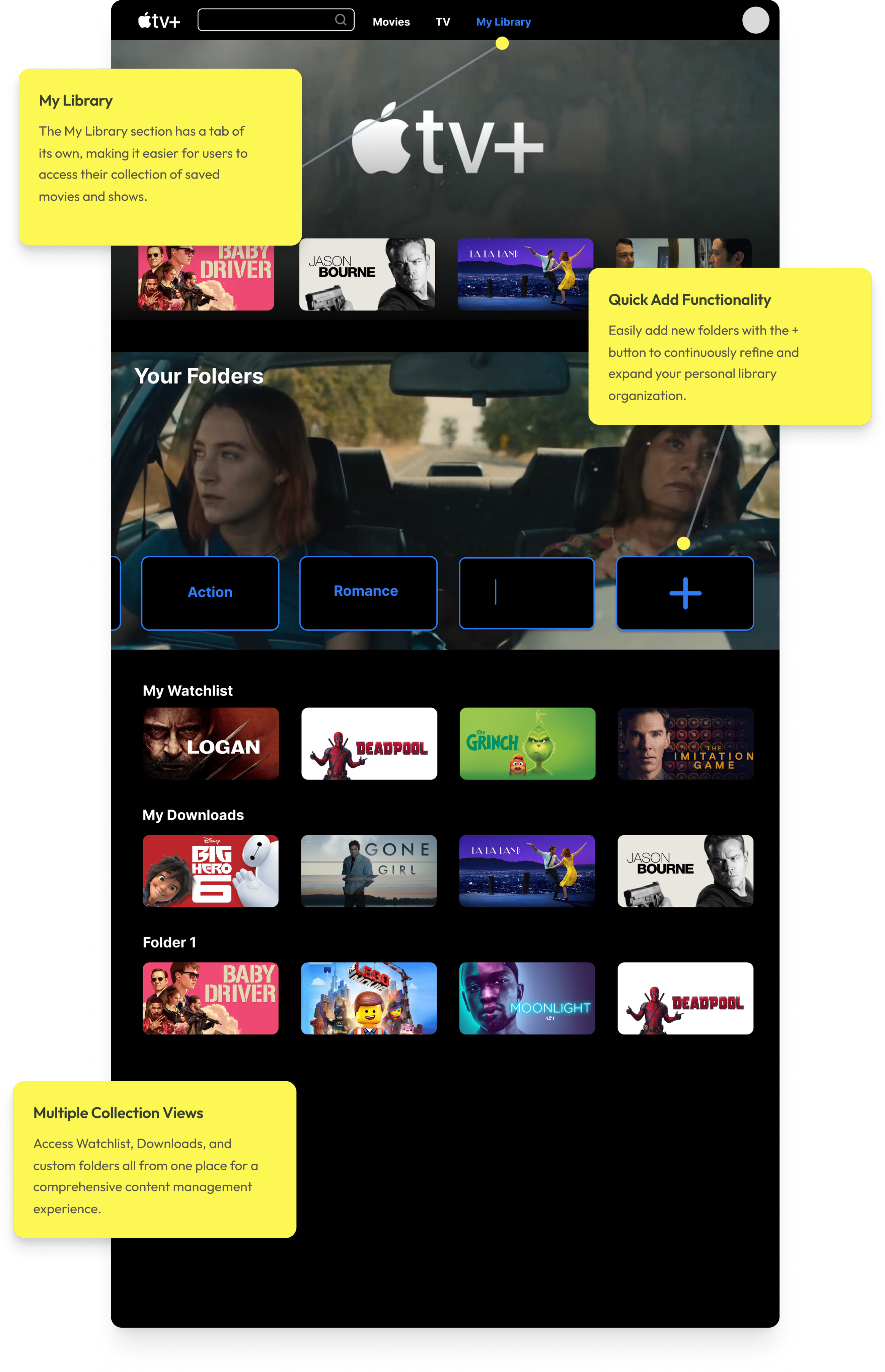
LIBRARY CUSTOMIZATION
Most importantly, the library system allows for user-centric customization, enabling individuals to curate their own collection of movies. Users can create folders or tags for specific genres, favorite actors, or preferred themes, providing a personalized and tailored streaming experience.
USER FLOW DEMO
PROTOTYPE IMPACT
DESIGN GOALS ACHIEVED
"Redesign Apple TV+ to improve content discoverability and usability — making the platform more intuitive for both Apple and non-Apple users."
IMPROVED CONTENT DISCOVERABILITY
Surfaced "Continue Watching," "Recents," and "My Watchlist" directly on the home page — fewer steps to the content that matters.
PERSONALIZED LIBRARY SYSTEM
User-created folders (Drama, Action, Thriller) now appear on the home page, turning the Library into a personal entry point for browsing.
PURCHASE TRANSPARENCY
"Buy" and "Rent" options surface clearly next to the primary CTA — eliminating confusion between included content and paid rentals.
REFLECTION
TAKEAWAYS
KEY FINDINGS
This project showed me that friction wasn't about missing content — it was about poor visibility. Users struggled to find what they wanted or understand what was available, not because it wasn't there, but because the structure got in the way.
LIBRARY REDESIGN
Rethinking the Library was the most interesting challenge. Adding folder creation gave users a faster, more personal way to access content they care about — and pushed me to consider how much flexibility helps before it starts to overwhelm.
LOOKING AHEAD →
I'd want to explore smarter personalization and a Library that adapts to each user over time. This project helped me translate research into clear design decisions and better understand how people navigate streaming platforms.
NEXT CASE STUDY →
project 03
Apple TV+
Redesign Apple TV+ to improve content discoverability and usability— making the platform more intuitive for both Apple and non-Apple users.
PrOJECT TYPE
Academic
role
UI/UX Designer
YEAR
2024
Apple TV+ launched in 2019 as Apple's entry into the streaming market, bundled with Apple devices and positioned around exclusive original content. Unlike competitors such as Netflix or Hulu, it has a smaller content library — making discoverability and ease of navigation even more critical to user retention.
While Apple users benefit from seamless ecosystem integration, non-Apple users face additional friction navigating a platform that wasn't designed with them in mind. This project examines how restructuring the Apple TV+ interface could make the experience more intuitive and accessible for a broader audience.
RESEARCH METHOD
I began with a research question:
How might we redesign the Apple TV+ experience to help new users more easily discover, organize, and access content across mobile and desktop platforms?
10
INTERVIEWS
with active Apple TV+ users
100+
ONLINE REVIEWS
from the general Apple TV+ user base on Reddit, Apple Support Community, and Apple Store
Decision Tree
The tree's structure reveals Apple TV+ as subscription-first: three entry points collapse into one flow, with the paywall as the only meaningful branch.
NAVIGATION DECISION TREE
Simplified to illustrate the core decision architecture — not a 1:1 map of the interface.
Search
NO
Open Apple TV+
Watch Now
Library
Select Title
Included in Apple TV+?
Stream Now
YES
NO
Save to Watchlist?
Saved ✓
Browse More
YES
Confirm Purchase?
Play Now
Cancel
YES
NO
Rent / Buy
User Interview
10 user interviews revealed three recurring pain points that consistently disrupt the Apple TV+ viewing experience.
USER RESEARCH FINDINGS
01
Navigation Issues
Confusing categories make it hard to find a show.
USER A
"Genre headings require you to keep clicking on the right arrow to find a show... It's tedious to find a show."
USER B
"I don't know where the search bar is. Does 'Watch Now' include both subscription-based and rental content?"
02
Missing Key Functions
Key features such as a watchlist, a search bar, or a "skip the intro" option are missing.
USER C
"Search and Watchlist are fundamental to any streaming platform, but they're nowhere to be found."
03
Lack of Feature Optimization
The Library section, which is unique to Apple TV+, isn't fully utilized.
USER D
"Unlike purely subscription-based platforms, Apple TV+ offers rental or purchasing options that incentivize users to utilize the content library."
MOVING FORWARD...
01
Rearrange, create, and remove categories to facilitate content discovery.
02
Research key functions of streaming platforms and implement them for cross-platform design consistency.
03
Develop and highlight the Library for product differentiation.
Wireframes
This step helped to paint a bigger picture of the user experience and consider the practicality of some features I wanted to incorporate.
I also looked at examples from other streaming websites to learn more about UI principles for video-centered products. I noticed that some common features were “Continue Watching,” “Recents,” and a user’s “Watchlist.”
MOBILE PROTOTYPE MODIFICATIONS
Watch Now

Movies
TV
Continue Watching

You Might Like...
Trending Now
Top Picks

2
3
4
Store
Apple TV Channels

New Arrivals
Staff Picks
New on Apple TV+
Browse by Genre
1
Library
My Playlist
My Downloads
Recently Added
Watch History
Search
Q
Related Movies
Genre
Top Searches
Recently Searched
Browse Categories
Key Redesigns (Mobile)
1
Apple TV+ Originals placed under the "Store" category
2
A toggle feature that separates Movies from TV
3
A "Continue Watching" option
4
A Library tab on the home page
Key Redesigns (Desktop)
1
The elimination of "Watch Now" and "Kids" sections
2
The integration of the "Watchlist" in "Library"
3
The addition of a step between the landing page and the movie description page through a pop-up box
Movies
TV
My Library
Your Library
You Might Like...
1
Movies
TV
My Library
Top Choices
You Watched (Title). You Might Like...
Newest on Apple TV
Recommended Genre 1
2
Movies
TV
My Library
Top Choices
3
DESKTOP PROTOTYPE MODIFICATIONS
TAKEAWAYS FROM USER TESTING
01
Content Navigation
TASK
Find the cast of a movie from My Watchlist
↓
FINDING
Users could not intuitively navigate from the Watchlist to a movie's cast information.
↓
NEXT STEPS
Make the Watchlist more visible on the home page
02
Library Feature Integration
TASK
Make a folder in your library
↓
FINDING
Users were unable to discover the folder creation feature without prompting. Many expected a more prominent entry point, and participants raised concerns about folder clutter on the mobile screen.
↓
NEXT STEPS
Add a pop-up to nudge the user to use the library system, add the ability to search for a specific category, and consider space with many folders in mobile
High-Fidelity Prototype
The final prototype showcased streamlined layouts, easy-to-navigate sections, and appropriately sized thumbnails, which contributed to an improved visual experience for users.
For the purpose of the case study, I focused on three main features; homepage, content detail page, and the Library.
HOMEPAGE
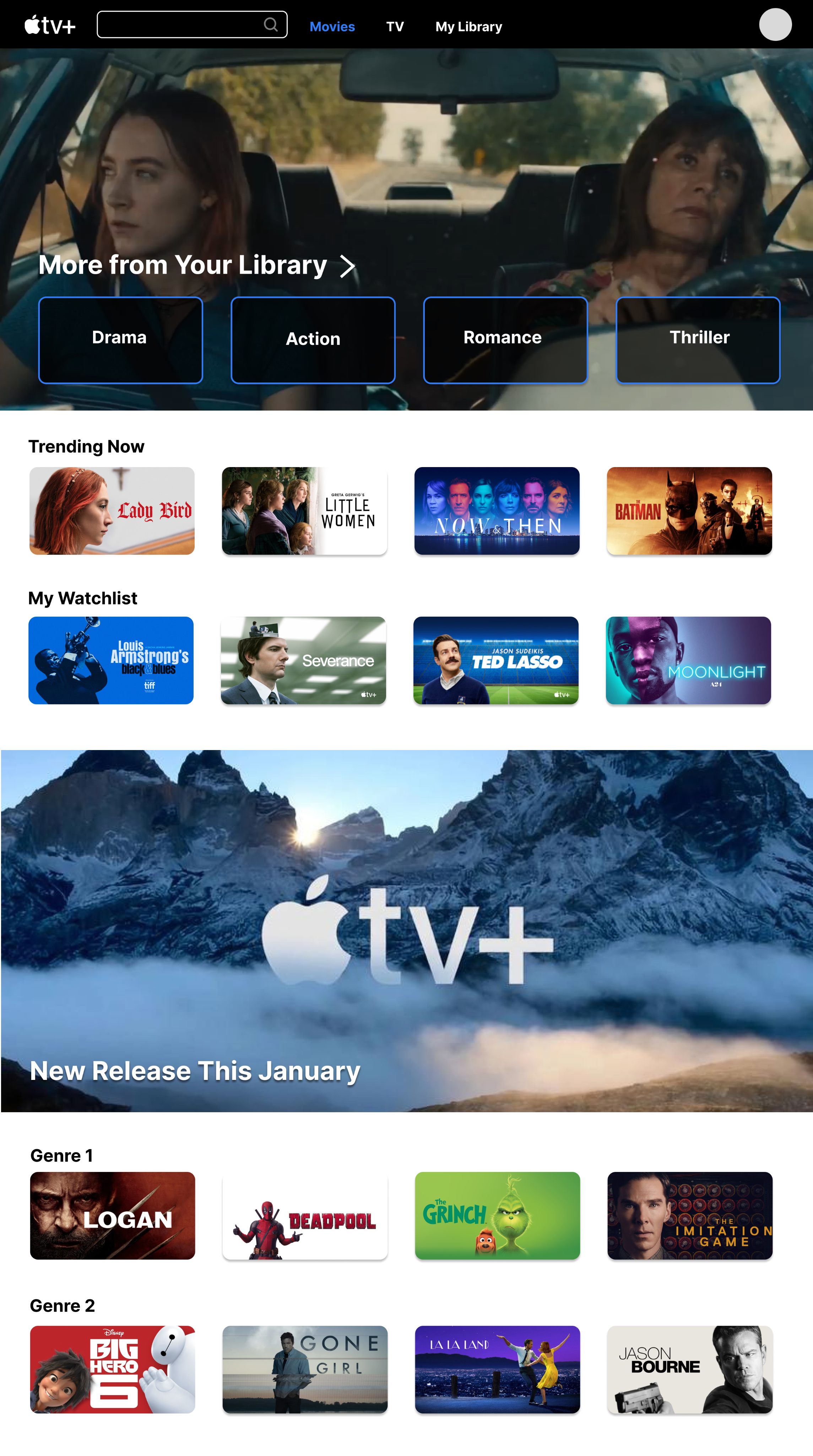


My Watchlist
Quick access to saved content, creating faster entry points into browsing without scrolling for long.
Custom Folder Organization
Users can organize content by any custom category that reflects personal preferences.
More from Your Library
User-created folders surface directly on the homepage, replacing system-defined genres with personalized collections.
The redesigned homepage prioritizes "More from Your Library", allowing users to immediately browse content based on previously saved or watched titles.
Instead of relying on system-defined genres, this redesign also surfaces user-created folders from the Library (e.g., Drama, Action, Romance, Thriller) directly on the home page. This empowers users to organize content in a way that reflects their personal preferences and creates faster, more meaningful entry points into browsing.
CONTENT DETAIL & PRICING
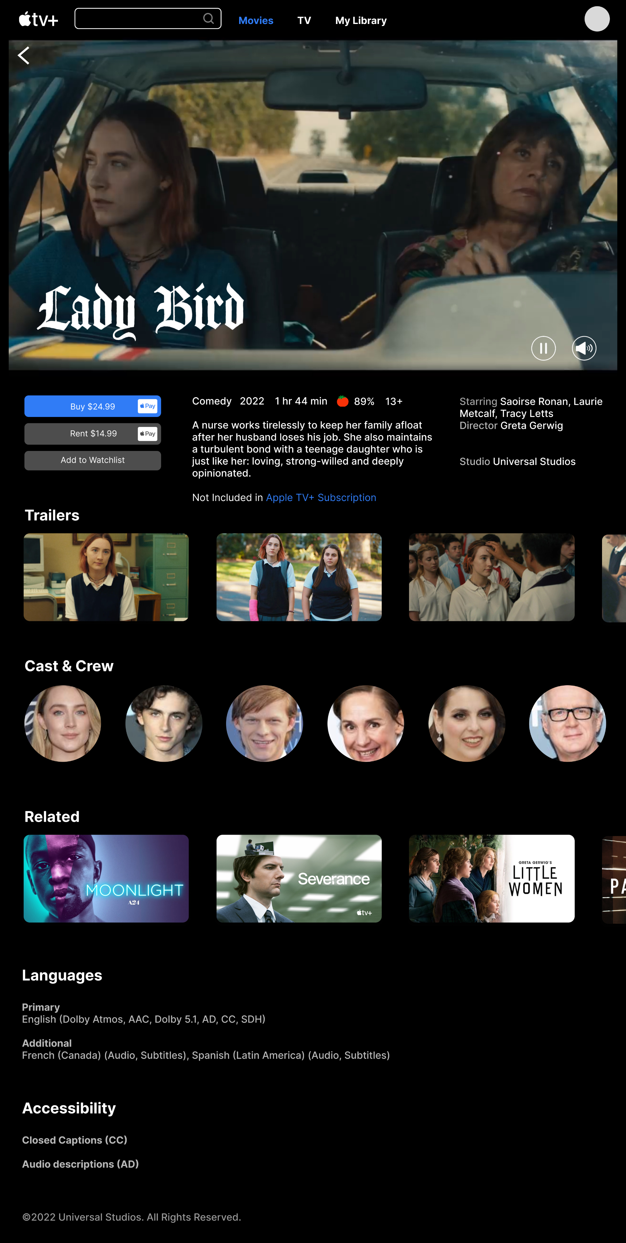


Related Content
Curated recommendations based on viewing history and saved content, surfaced in an organized manner.
Transparent Content Access
The interface clearly distinguishes between AppleTv+ Originals and non-subscription content, helping users make informed decisions quickly.


Related Content
Curated recommendations based on viewing history and saved content, surfaced in an organized manner.
Transparent Content Access
The interface clearly distinguishes between AppleTv+ Originals and non-subscription content, helping users make informed decisions quickly.
Clear Pricing Display
Buy and Rent options are prominently displayed, eliminating confusion about content availability and pricing.
The original Apple TV+ interface often blurs the line between included content and rentals, creating confusion about what users can watch immediately. This redesign clearly surfaces pricing and purchase options (“Buy” vs. “Rent”) alongside the primary call-to-action, reducing uncertainty and helping users make faster decisions.
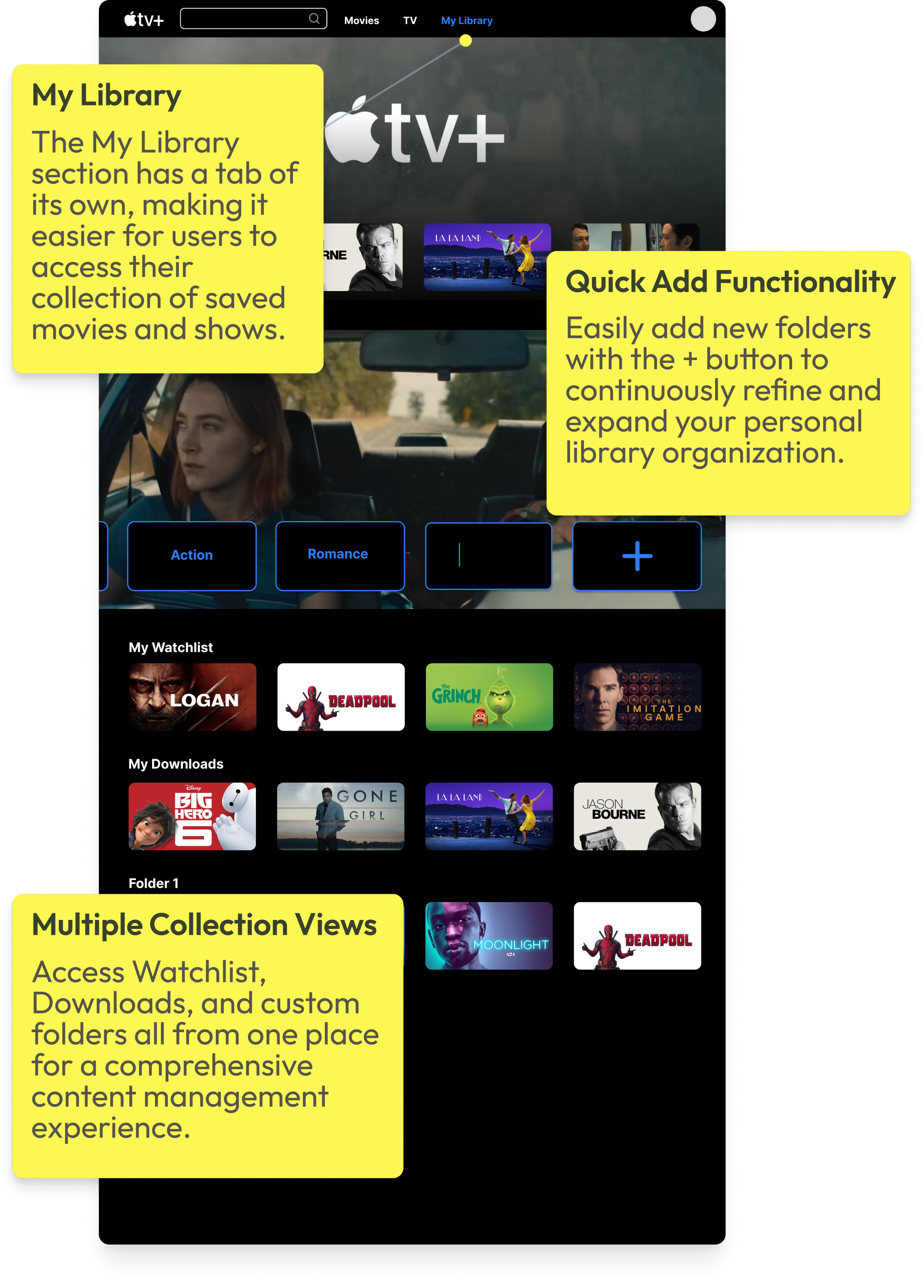
LIBRARY CUSTOMIZATION


Multiple Collection Views
Access Watchlist, Downloads, and custom folders all from one place for a comprehensive content management experience.
Quick Add Functionality
Easily add new folders with the + button to continuously refine and expand your personal library organization.
My Library
The My Library section has a tab of its own, making it easier for users to access their collection of saved movies and shows.
Most importantly, the library system allows for user-centric customization, enabling individuals to curate their own collection of movies. Users can create folders or tags for specific genres, favorite actors, or preferred themes, providing a personalized and tailored streaming experience.
USER FLOW DEMO
PROTOTYPE IMPACT
DESIGN GOALS ACHIEVED
"Redesign Apple TV+ to improve content discoverability and usability — making the platform more intuitive for both Apple and non-Apple users."
IMPROVED CONTENT DISCOVERABILITY
Surfaced "Continue Watching," "Recents," and "My Watchlist" directly on the home page — fewer steps to the content that matters.
PERSONALIZED LIBRARY SYSTEM
User-created folders (Drama, Action, Thriller) now appear on the home page, turning the Library into a personal entry point for browsing.
PURCHASE TRANSPARENCY
"Buy" and "Rent" options surface clearly next to the primary CTA — eliminating confusion between included content and paid rentals.
TAKEAWAYS
KEY FINDINGS
This project showed me that friction wasn't about missing content — it was about poor visibility. Users struggled to find what they wanted or understand what was available, not because it wasn't there, but because the structure got in the way.
LIBRARY REDESIGN
Rethinking the Library was the most interesting challenge. Adding folder creation gave users a faster, more personal way to access content they care about — and pushed me to consider how much flexibility helps before it starts to overwhelm.
I'd want to explore smarter personalization and a Library that adapts to each user over time. This project helped me translate research into clear design decisions and better understand how people navigate streaming platforms.
LOOKING AHEAD →
project 03
Apple TV+
Redesign Apple TV+ to improve content discoverability and usability — making the platform more intuitive for both Apple and non-Apple users.
PrOJECT TYPE
Academic
role
UI/UX Designer
YEAR
2024
Apple TV+ launched in 2019 as Apple's entry into the streaming market, bundled with Apple devices and positioned around exclusive original content. Unlike competitors such as Netflix or Hulu, it has a smaller content library — making discoverability and ease of navigation even more critical to user retention.
While Apple users benefit from seamless ecosystem integration, non-Apple users face additional friction navigating a platform that wasn't designed with them in mind. This project examines how restructuring the Apple TV+ interface could make the experience more intuitive and accessible for a broader audience.
RESEARCH METHOD
I began with a research question:
How might we redesign the Apple TV+ experience to help new users more easily discover, organize, and access content across mobile and desktop platforms?
10
INTERVIEWS
with active Apple TV+ users
100+
ONLINE REVIEWS
from the general Apple TV+ user base on Reddit, Apple Support Community, and Apple Store
Decision Tree
The tree's structure reveals Apple TV+ as subscription-first: three entry points collapse into one flow, with the paywall as the only meaningful branch.
NAVIGATION DECISION TREE
Open Apple TV+
Watch Now
Library
Search
Select Title
Included in Apple TV+?
Stream Now
Rent / Buy
YES
NO
Save to Watchlist?
Saved ✓
Browse More
YES
NO
Confirm Purchase?
Play Now
Cancel
YES
NO
Simplified to illustrate the core decision architecture — not a 1:1 map of the interface.
User Interview
10 user interviews revealed three recurring pain points that consistently disrupt the Apple TV+ viewing experience.
USER RESEARCH FINDINGS
01
Navigation Issues
Confusing categories make it hard to find a show.
USER A
"Genre headings require you to keep clicking on the right arrow to find a show... It's tedious to find a show."
USER B
"I don't know where the search bar is. Does 'Watch Now' include both subscription-based and rental content?"
02
Missing Key Functions
Key features such as a watchlist, a search bar, or a "skip the intro" option are missing.
USER C
"Search and Watchlist are fundamental to any streaming platform, but they're nowhere to be found."
03
Lack of Feature Optimization
The Library section, which is unique to Apple TV+, isn't fully utilized.
USER D
"Unlike purely subscription-based platforms, Apple TV+ offers rental or purchasing options that incentivize users to utilize the content library."
MOVING FORWARD...
01
Rearrange, create, and remove categories to facilitate content discovery.
02
Research key functions of streaming platforms and implement them for cross-platform design consistency.
03
Develop and highlight the Library for product differentiation.
Wireframes
This step helped to paint a bigger picture of the user experience and consider the practicality of some features I wanted to incorporate.
I also looked at examples from other streaming websites to learn more about UI principles for video-centered products. I noticed that some common features were “Continue Watching,” “Recents,” and a user’s “Watchlist.”
MOBILE PROTOTYPE MODIFICATIONS
Key Redesigns (Mobile)
1
Apple TV+ Originals placed under the "Store" category
2
A toggle feature that separates Movies from TV
3
A "Continue Watching" option
4
A Library tab on the home page
Watch Now

Movies
TV
Continue Watching

You Might Like...
Trending Now
Top Picks

2
3
4
Store
Apple TV Channels

New Arrivals
Staff Picks
New on Apple TV+
Browse by Genre
1
Library
My Playlist
My Downloads
Recently Added
Watch History
Search
Q
Related Movies
Genre
Top Searches
Recently Searched
Browse Categories
DESKTOP PROTOTYPE MODIFICATIONS
Key Redesigns (Desktop)
1
The elimination of "Watch Now" and "Kids" sections
2
The integration of the "Watchlist" in "Library"
3
The addition of a step between the landing page and the movie description page through a pop-up box
Movies
TV
My Library
Your Library
You Might Like...
1
Movies
TV
My Library
Top Choices
You Watched (Title). You Might Like...
Newest on Apple TV
Recommended Genre 1
2
Movies
TV
My Library
Top Choices
3
TAKEAWAYS FROM USER TESTING
01
Content Navigation
TASK
Find the cast of a movie from My Watchlist
↓
FINDING
Users could not intuitively navigate from the Watchlist to a movie's cast information.
↓
NEXT STEPS
Make the Watchlist more visible on the home page
02
Library Feature Integration
TASK
Make a folder in your library
↓
FINDING
Users were unable to discover the folder creation feature without prompting. Many expected a more prominent entry point, and participants raised concerns about folder clutter on the mobile screen.
↓
NEXT STEPS
Add a pop-up to nudge the user to use the library system, add the ability to search for a specific category, and consider space with many folders in mobile
High-Fidelity Prototype
The final prototype showcased streamlined layouts, easy-to-navigate sections, and appropriately sized thumbnails, which contributed to an improved visual experience for users.
For the purpose of the case study, I focused on three main features; homepage, content detail page, and the Library.
HOMEPAGE
The redesigned homepage prioritizes "More from Your Library", allowing users to immediately browse content based on previously saved or watched titles. Instead of relying on system-defined genres, this redesign surfaces user-created folders from the Library (e.g., Drama, Action, Romance, Thriller) directly on the home page. This empowers users to organize content in a way that reflects their personal preferences and creates faster, more meaningful entry points into browsing.
CONTENT DETAIL & PRICING
The original Apple TV+ interface often blurs the line between included content and rentals, creating confusion about what users can watch immediately. This redesign clearly surfaces pricing and purchase options (“Buy” vs. “Rent”) alongside the primary call-to-action, reducing uncertainty and helping users make faster decisions.
LIBRARY CUSTOMIZATION
Most importantly, the library system allows for user-centric customization, enabling individuals to curate their own collection of movies. Users can create folders or tags for specific genres, favorite actors, or preferred themes, providing a personalized and tailored streaming experience.
USER FLOW DEMO
PROTOTYPE IMPACT
DESIGN GOALS ACHIEVED
"Redesign Apple TV+ to improve content discoverability and usability — making the platform more intuitive for both Apple and non-Apple users."
IMPROVED CONTENT DISCOVERABILITY
Surfaced "Continue Watching," "Recents," and "My Watchlist" directly on the home page — fewer steps to the content that matters.
PERSONALIZED LIBRARY SYSTEM
User-created folders (Drama, Action, Thriller) now appear on the home page, turning the Library into a personal entry point for browsing.
PURCHASE TRANSPARENCY
"Buy" and "Rent" options surface clearly next to the primary CTA — eliminating confusion between included content and paid rentals.
TAKEAWAYS
KEY FINDINGS
This project showed me that friction wasn't about missing content — it was about poor visibility. Users struggled to find what they wanted or understand what was available, not because it wasn't there, but because the structure got in the way.
LIBRARY REDESIGN
Rethinking the Library was the most interesting challenge. Adding folder creation gave users a faster, more personal way to access content they care about — and pushed me to consider how much flexibility helps before it starts to overwhelm.
LOOKING AHEAD →
I'd want to explore smarter personalization and a Library that adapts to each user over time. This project helped me translate research into clear design decisions and better understand how people navigate streaming platforms.