


FREQ_BAND: 432Hz
VELOCITY_AVG: 0.00
project 01
Path@Penn
Redesign
Making course registration faster by reducing clutter and eliminating tab switching so students can secure their classes before they fill up.
PrOJECT TYPE
Academic
role
UI/UX Designer
YEAR
2026
BACKGROUND

For Penn students, course registration is the most stressful week of the semester—second only to finals. Every second matters, but Path@Penn forces users to click through unnecessary tabs, hunt for information, and waste time.But what if Path@Penn worked with students, not against them?
Research & Insight
I began with a central question:
What are the main user pain points that slow down the course registration process on Path@Penn?

15

SURVEY
Students via Google Forms
5

INTERVIEWS
Students who actively use Path@Penn

RESEARCH QUESTION
20% of Respondents
reported spending more than 5 minutes on course registration — a process that, ideally, should take under a minute. Search, add, submit: it's straightforward by nature.
Students generally come in knowing what they want, so friction in the user journey is the most likely culprit. The next question pinpoints where exactly that friction lives.
REGISTRATION TIME

20%

13.3%

66.7%
2–5 minutes
10 of 15 students
66.7%
> 5 minutes
3 of 15 students
20%
< 1 minute
2 of 15 students
13.3%
How long does it take to add a course?
n = 15 Responses
The Tabs Feature
was rated the most difficult from the most prominent features of the course registration process, with 40% of respondents selecting the lowest score.
This is not a surprise, considering the fact that users are forced down a single linear tab path, with no way to view multiple tabs simultaneously — making the registration process far more time-consuming than it needed to be.
USABILITY RATINGS
CART
20%
40%
27%
13%
DEGREE
PLAN
13%
40%
40%
7%
CALEN-DAR
13%
33%
27%
20%
7%
TABS
40%
20%
33%
7%
1 — most difficult
2
3
4
5 —
most
usable
User Journey Analysis
Furthermore, through user journey interviews with 5 students, I explored the pain points and solutions to each step of the user journey from accessing the landing page to registering for class.
USER JOURNEY
01
STAGE 1
Access Platform
02
STAGE 2
Search for Courses
03
STAGE 3
01
STAGE 1
Review Course Details
04
STAGE 4
01
STAGE 1
Add to Cart
05
STAGE 5
01
STAGE 1
Submit Schedule
PAIN POINTS
• Too many options on landing page
• Unclear navigation structure
PAIN POINTS
• Must scroll through hundreds of options
• Checking for degree requirement is confusing
PAIN POINTS
• Only one tab active at a time
• Must exit to view current schedule
PAIN POINTS
• Must navigate away from search
• Unclear feedback when adding
PAIN POINTS
• "Submit" buttons cause confusion
• Redundant confirmation steps
ITERATIONS
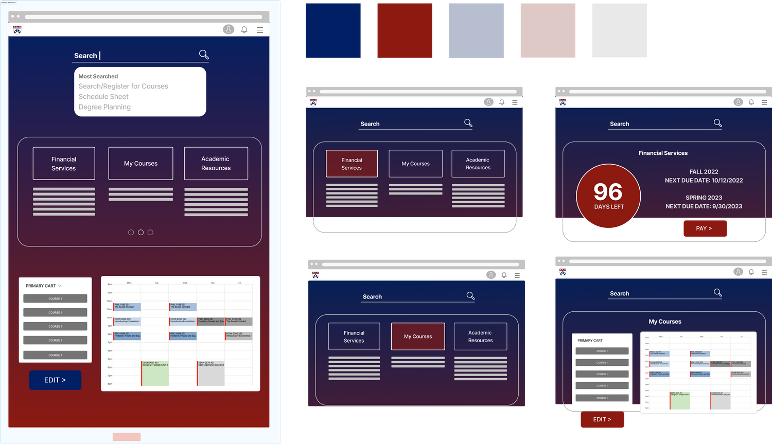
Low-Fidelity Prototype
The iteration process started with wireframe featuring the landing page, focusing on organizing existing clutter of direct links under simple, consolidated categories. I also experimented with the colors used by UPenn’s official websites and logo.
01
READABILITY
Low contrast between gradient background and text makes sections hard to read.
02
SEARCH PLACEMENT
The oversized search bar dominates the page and pulls focus away from primary tasks.
03
CONTENT CLARITY
Long link lists feel dense and are difficult to scan. Task-based modules with clearer labels are needed.
FEEDBACK FROM PEERS
final prototype
High-Fidelity Prototype
Incorporating the peer feedback from class, I redesigned the wireframe and built a high-fidelity prototype that addressed the key pain points spotted during the user journey interviews.
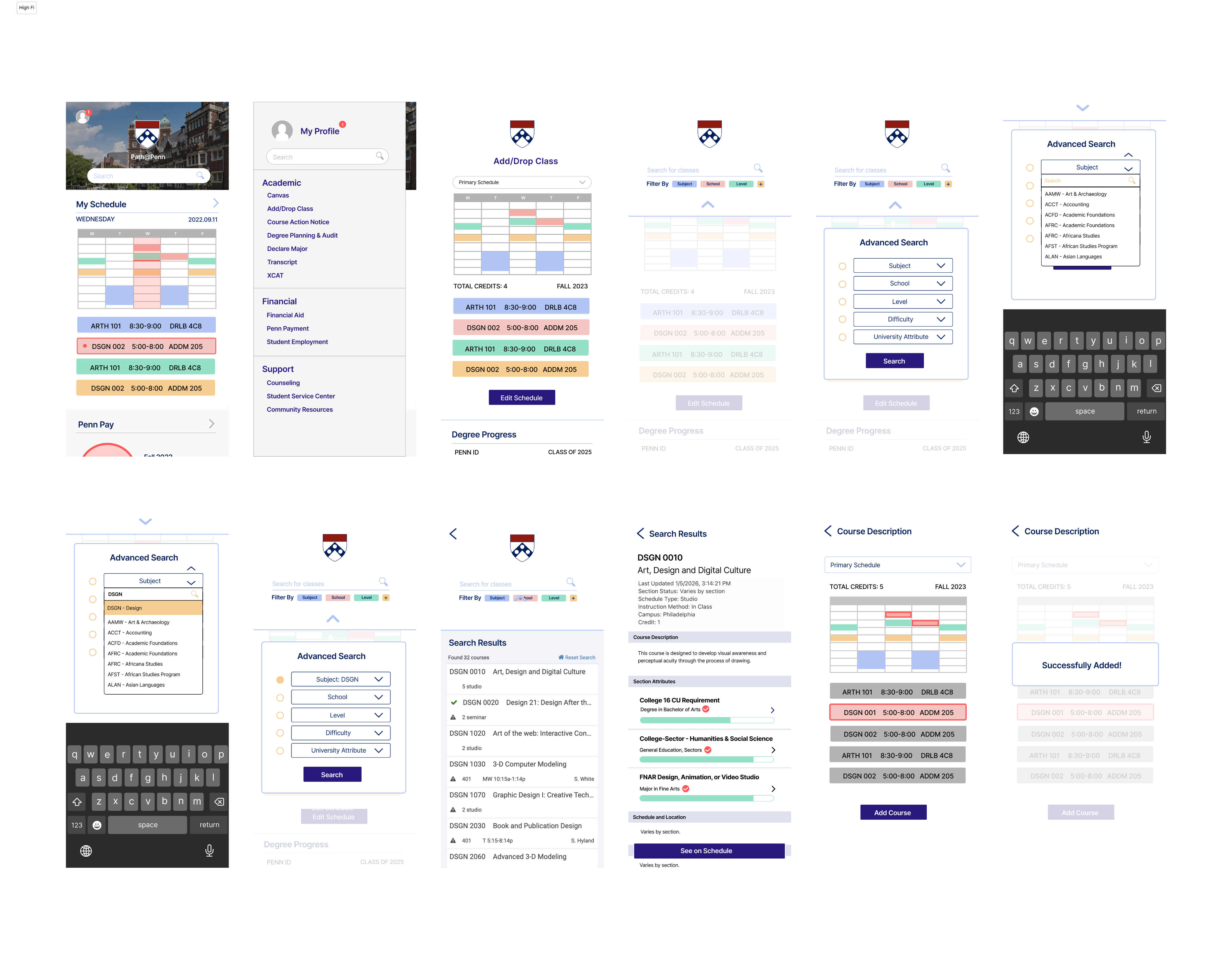
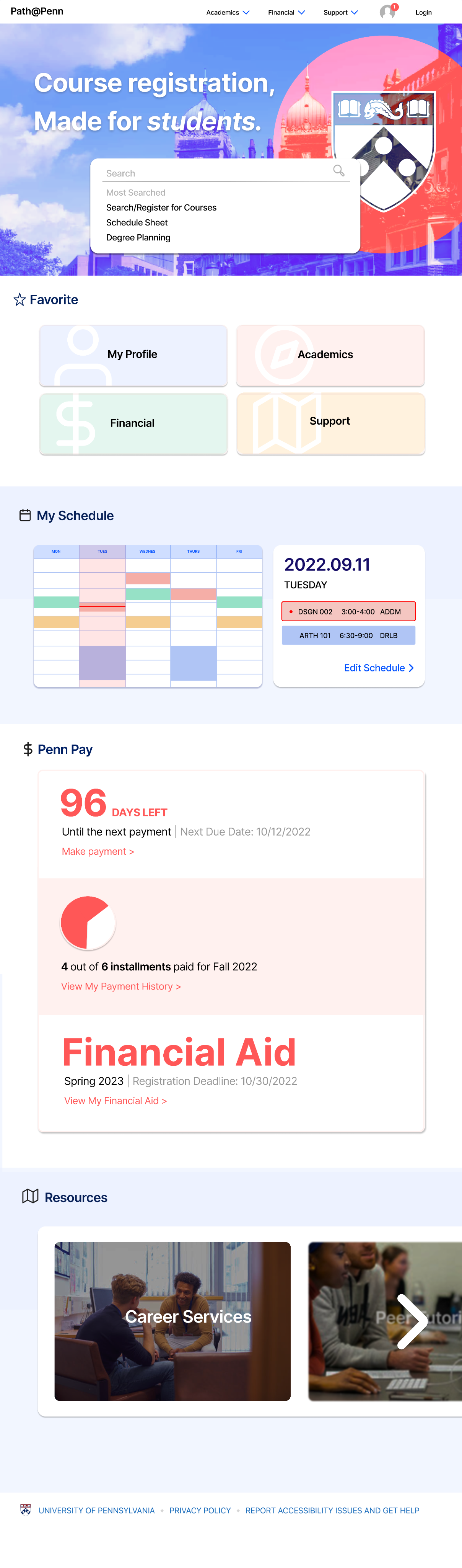
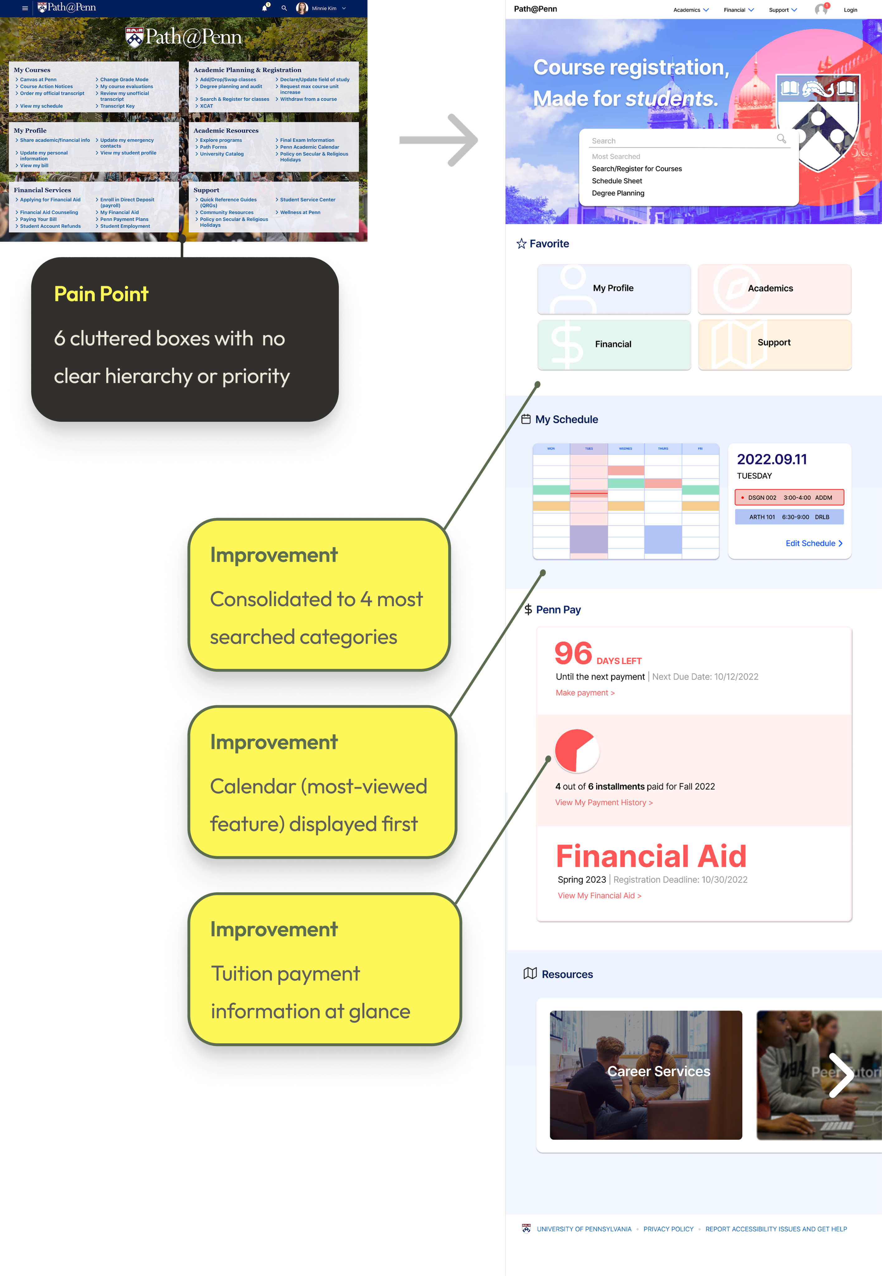
The first goal was to design a home page that feels cleaner and highlights the features students use most. I prioritized displaying the class schedule first, with an arrow button on the right that leads to the Add/Drop Class feature. On the sidebar, I reorganized the original six sections into four broader categories — My Profile, Academic, Financial, and Support — consolidating overlapping content and linking directly to the tools students need.
MOBILE LANDING PAGE DESIGN
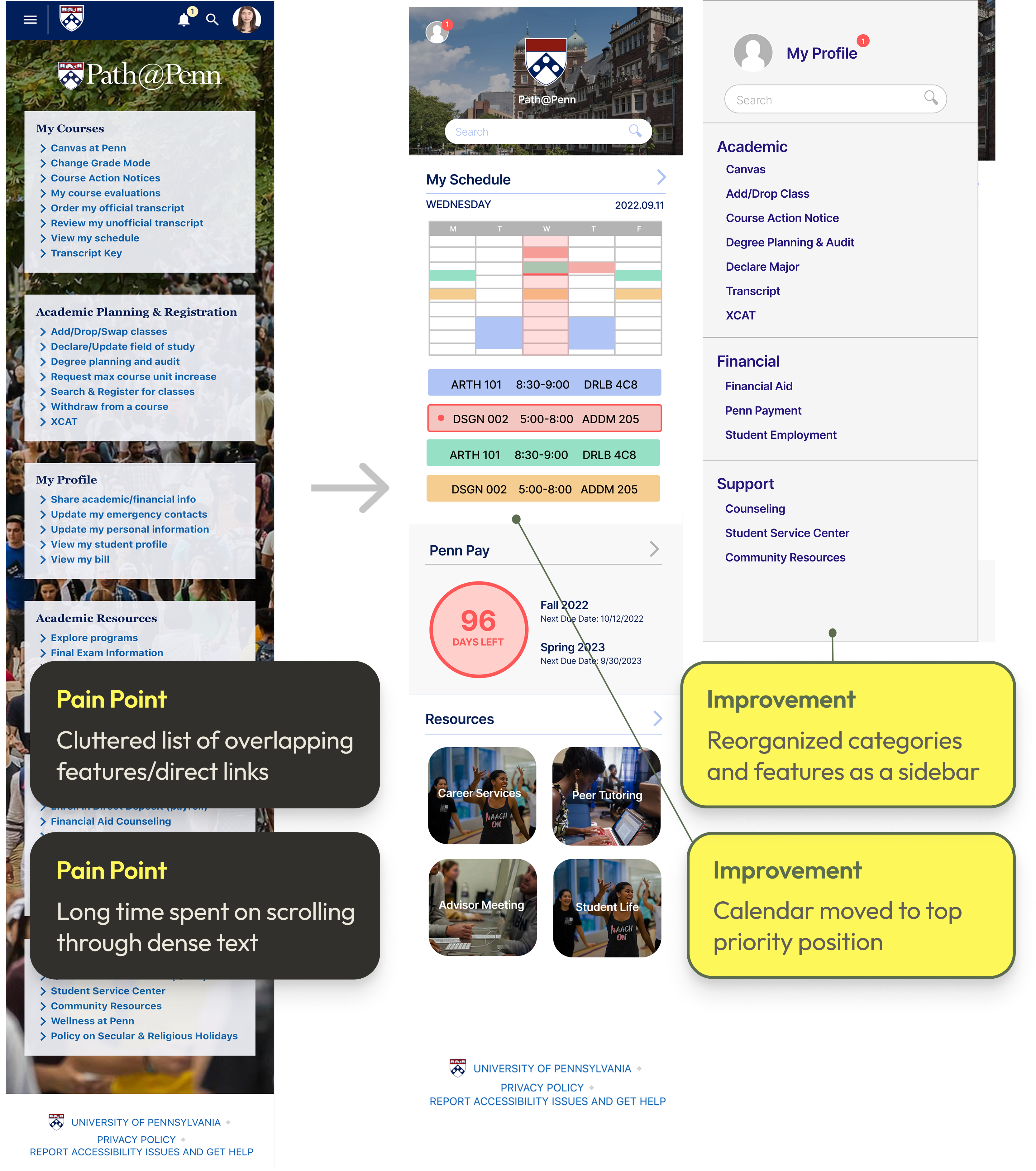
WEBSITE LANDING PAGE DESIGN
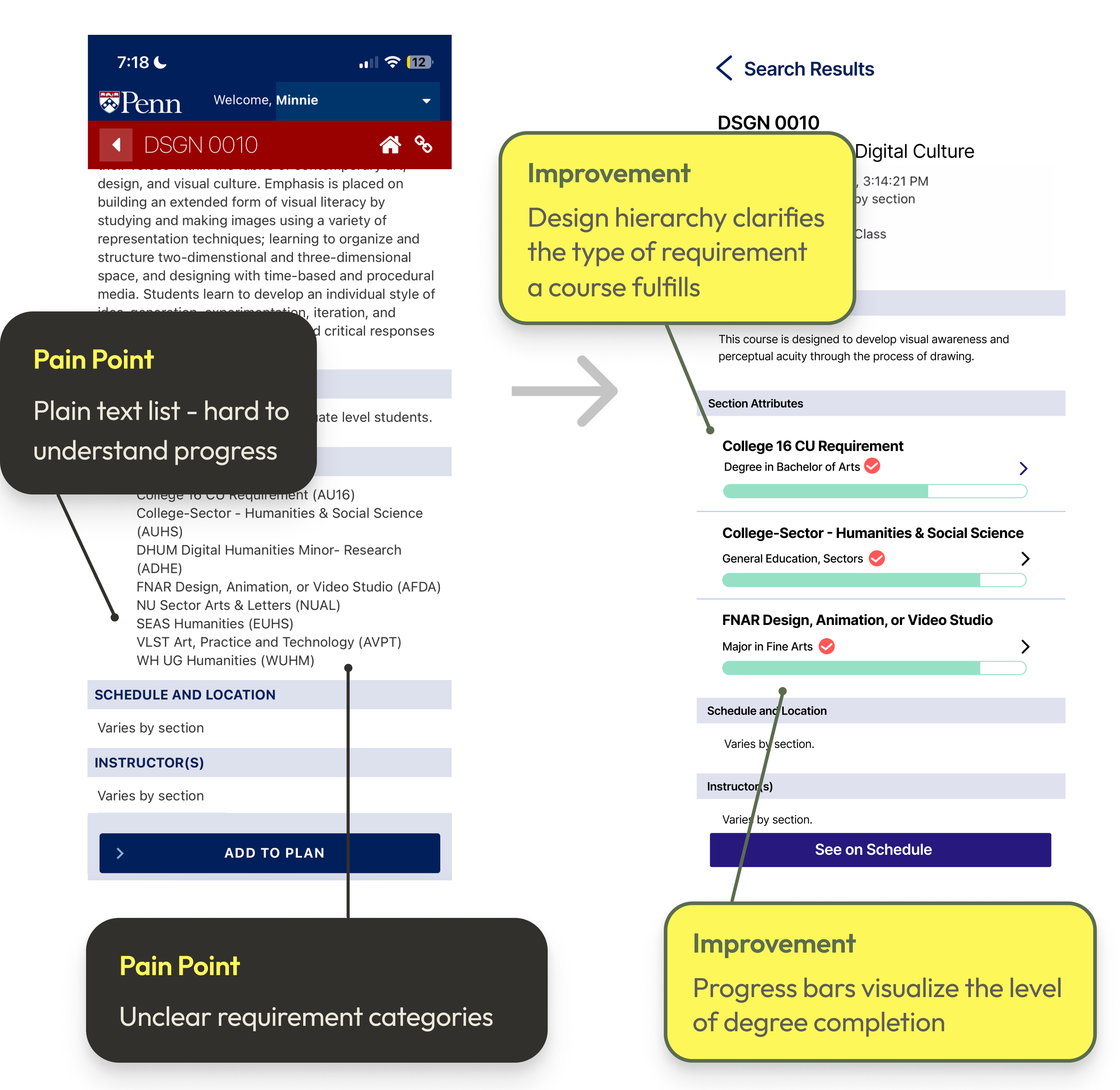
Next, I redesigned the Section Attributes area to make degree requirements clearer and more actionable. Each requirement category now includes a labeled progress bar that shows how much of that requirement the student has completed, along with the specific section attributes that fulfill it.
MOBILE SECTION ATTRIBUTES DESIGN
MOBILE REGISTRATION FLOW DESIGN
With the final prototype, the course registration process becomes more straightforward. Right before signing up for a course, students now have a clear visual of their current schedule and can see exactly how a selected class fits with the rest of their courses before adding it to the schedule. This directly resolves the most cited pain point from the initial research: the tabbing system. By replacing the linear, one-at-a-time navigation with a unified view, everything is accessible at once.
OLD VERSION

NEW VERSION
PROTOTYPE IMPACT
DESIGN GOAL ACHIEVED
"A simpler, more unified registration flow that saves time."
STREAMLINED SEARCH
Eliminates the need to scroll through hundreds of options in the advanced search panel.
SCHEDULE PREVIEW
Students see exactly how a selected class fits their current schedule before adding it.
REDUCED TAB FRICTION
Fewer tabs to exit when checking the current schedule — everything in one unified view.
REFLECTION
TAKEAWAYS
PEER FEEDBACK
Peer feedback is invaluable in shaping stronger design decisions and incorporating it early leads to more thoughtful outcomes.
DESIGN SYSTEM
Establishing a design system early maintains clarity and consistency as a project evolves and grows in complexity.
INTENTIONALITY
Slow down and think more intentionally about the core problem before moving into visual solutions.
LOOKING AHEAD →
01
Experiment with different ways of presenting key information and actions across screens.
02
Introduce opportunities for students to customize their dashboard based on preferences and academic needs.
NEXT CASE STUDY →
PrOJECT TYPE
Academic
role
UI/UX Designer
YEAR
2026
For Penn students, course registration is the most stressful week of the semester—second only to finals. Every second matters, but Path@Penn forces users to click through unnecessary tabs, hunt for information, and waste time.But what if Path@Penn worked with students, not against them?
20% of Respondents
reported spending more than 5 minutes on course registration — a process that, ideally, should take under a minute. Search, add, submit: it's straightforward by nature.
Students generally come in knowing what they want, so friction in the user journey is the most likely culprit. The next question pinpoints where exactly that friction lives.
REGISTRATION TIME
How long does it take to add a course?
n = 15 Responses
REGISTRATION TIME
2–5 minutes
10 of 15 students
66.7%
> 5 minutes
3 of 15 students
20%
< 1 minute
2 of 15 students
13.3%
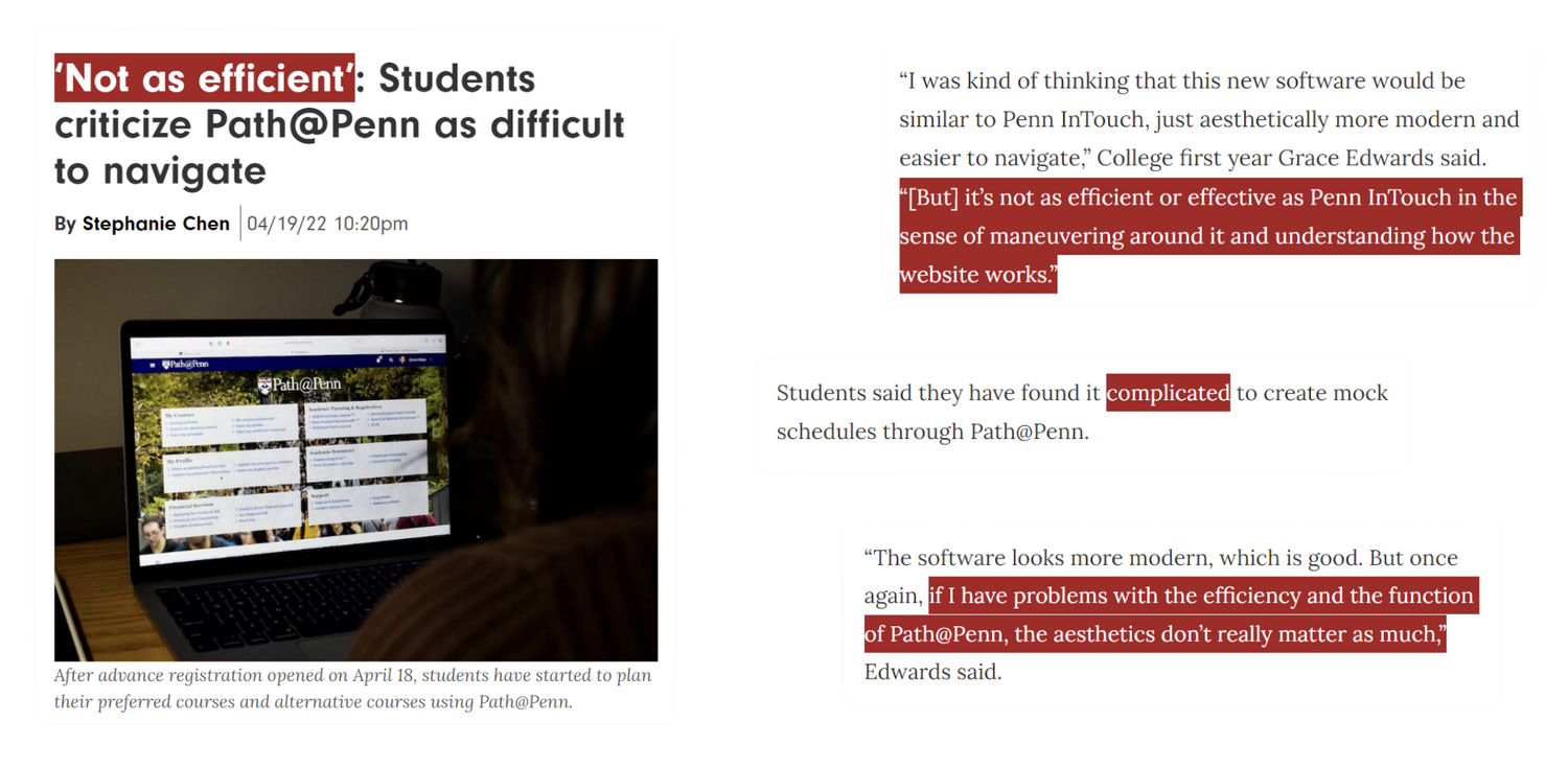
The Tabs Feature
was rated the most difficult from the most prominent features of the course registration process, with 40% of respondents selecting the lowest score.
This is not a surprise, considering the fact that users are forced down a single linear tab path, with no way to view multiple tabs simultaneously — making the registration process far more time-consuming than it needed to be.
USABILITY RATINGS
n = 15 respondents
CART
20%
40%
27%
13%
2.3/5
DEGREE
PLANNING
13%
40%
40%
7%
2.4/5
CALENDAR
13%
33%
27%
20%
7%
2.7/5
TABS
40%
20%
33%
7%
2.1/5
1 —
most difficult
2
3
4
5 —
most usable
User Journey Analysis
Furthermore, through user journey interviews with 5 students, I explored the pain points and solutions to each step of the user journey from accessing the landing page to registering for class.
Low-Fidelity Prototype
The iteration process started with wireframes featuring the landing page, focusing on organizing existing clutter of direct links under simple, consolidated categories. I also experimented with the colors used by UPenn’s official websites and logo.
High-Fidelity Prototype
Incorporating the peer feedback from class, I redesigned the wireframes and built a high-fidelity prototype that addressed the key pain points spotted during the user journey interviews.
The first goal was to design a home page that feels cleaner and highlights the features students use most. I prioritized displaying the class schedule first, with an arrow button on the right that leads to the Add/Drop Class feature. On the sidebar, I reorganized the original six sections into four broader categories — My Profile, Academic, Financial, and Support — consolidating overlapping content and linking directly to the tools students need.
MOBILE LANDING PAGE DESIGN
WEBSITE LANDING PAGE DESIGN
Next, I redesigned the Section Attributes area to make degree requirements clearer and more actionable. Each requirement category now includes a labeled progress bar that shows how much of that requirement the student has completed, along with the specific section attributes that fulfill it.
MOBILE SECTION ATTRIBUTES DESIGN
MOBILE REGISTRATION FLOW DESIGN
With the final prototype, the course registration process becomes more straightforward. Right before signing up for a course, students now have a clear visual of their current schedule and can see exactly how a selected class fits with the rest of their courses before adding it to the schedule. This directly resolves the most cited pain point from the initial research — the tabbing system — by replacing the linear, one-at-a-time navigation with a unified view that keeps everything accessible at once.
OLD VERSION

NEW VERSION
TAKEAWAYS
PEER FEEDBACK
Peer feedback is invaluable in shaping stronger design decisions and incorporating it early leads to more thoughtful outcomes.
DESIGN SYSTEM
Establishing a design system early maintains clarity and consistency as a project evolves and grows in complexity.
INTENTIONALITY
Slow down and think more intentionally about the core problem before moving into visual solutions.
LOOKING AHEAD →
01
Experiment with different ways of presenting key information and actions across screens.
02
Introduce opportunities for students to customize their dashboard based on preferences and academic needs.
PrOJECT TYPE
Academic
role
UI/UX Designer
YEAR
2026
For Penn students, course registration is the most stressful week of the semester—second only to finals. Every second matters, but Path@Penn forces users to click through unnecessary tabs, hunt for information, and waste time.But what if Path@Penn worked with students, not against them?
20% of Respondents
reported spending more than 5 minutes on course registration — a process that, ideally, should take under a minute. Search, add, submit: it's straightforward by nature. Students generally come in knowing what they want, so friction in the user journey is the most likely culprit. The next question pinpoints where exactly that friction lives.
REGISTRATION TIME
How long does it take to add a course?
n = 15 Responses
2–5 minutes
10 of 15 students
66.7%
> 5 minutes
3 of 15 students
20%
< 1 minute
2 of 15 students
13.3%
The Tabs Feature
was rated the most difficult from the most prominent features of the course registration process, with 40% of respondents selecting the lowest score. This is not a surprise, considering the fact that users are forced down a single linear tab path, with no way to view multiple tabs simultaneously — making the registration process far more time-consuming than it needed to be.
USABILITY RATINGS
n = 15 respondents
CART
20%
40%
27%
13%
2.3/5
DEGREE
PLANNING
13%
40%
40%
7%
2.4/5
CALENDAR
13%
33%
27%
20%
7%
2.7/5
TABS
40%
20%
33%
7%
2.1/5
1 — most difficult
2
3
4
5 — most usable
User Journey Analysis
Furthermore, through user journey interviews with 5 students, I explored the pain points and solutions to each step of the user journey from accessing the landing page to registering for class.
Low-Fidelity Prototype
The iteration process started with wireframes featuring the landing page, focusing on organizing existing clutter of direct links under simple, consolidated categories. I also experimented with the colors used by UPenn’s official websites and logo.
High-Fidelity Prototype
Incorporating the peer feedback from class, I redesigned the wireframes and built a high-fidelity prototype that addressed the key pain points spotted during the user journey interviews.
The first goal was to design a home page that feels cleaner and highlights the features students use most. I prioritized displaying the class schedule first, with an arrow button on the right that leads to the Add/Drop Class feature. On the sidebar, I reorganized the original six sections into four broader categories — My Profile, Academic, Financial, and Support — consolidating overlapping content and linking directly to the tools students need.
MOBILE LANDING PAGE DESIGN
WEBSITE LANDING PAGE DESIGN
Next, I redesigned the Section Attributes area to make degree requirements clearer and more actionable. Each requirement category now includes a labeled progress bar that shows how much of that requirement the student has completed, along with the specific section attributes that fulfill it.
MOBILE SECTION ATTRIBUTES DESIGN
MOBILE REGISTRATION FLOW DESIGN
With the final prototype, the course registration process becomes more straightforward. Right before signing up for a course, students now have a clear visual of their current schedule and can see exactly how a selected class fits with the rest of their courses before adding it to the schedule. This directly resolves the most cited pain point from the initial research — the tabbing system — by replacing the linear, one-at-a-time navigation with a unified view that keeps everything accessible at once.
OLD VERSION

NEW VERSION
TAKEAWAYS
PEER FEEDBACK
Peer feedback is invaluable in shaping stronger design decisions and incorporating it early leads to more thoughtful outcomes.
DESIGN SYSTEM
Establishing a design system early maintains clarity and consistency as a project evolves and grows in complexity.
INTENTIONALITY
Slow down and think more intentionally about the core problem before moving into visual solutions.
LOOKING AHEAD →
01
Experiment with different ways of presenting key information and actions across screens.
02
Introduce opportunities for students to customize their dashboard based on preferences and academic needs.